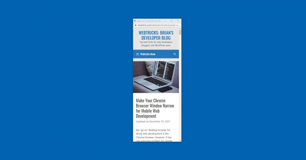
My “go-to” desktop browser for doing web development is the Chrome browser. However, it has one annoying problem for people like me who do responsive web development: It won’t resize down to 320 pixels wide, the width of an iPhone. With my Chrome browser on Windows, the minimum width is 500px. On Mac, the minimum is 400px. This makes it a pain to quickly check mobile layouts during development. You can’t make the Chrome browser window thin enough!
Firefox, on the other hand, will get as thin as I need it to! But, It’s inconvenient to have to use two different browsers during development.
Here are three ways to make your Chrome browser window narrow!
Solution #1: Launch a Resizable Chrome Window
My solution is to launch a narrow adjustable Chrome browser window in JavaScript. I made a script that does just that. Just paste in the full URL (including “https://”), and it will launch in a 320px wide browser window!
This works on Chrome for Mac and Windows. During development, I launch this once, and refresh it using the F5 key.
Note, this assumes your browser scroll bar is 17px wide (it varies between browsers, but that’s what it is on default Chrome). The actual browser launched is 320+17px = 337px wide, resulting in a browser window that is 320px wide.
Solution #2: Chrome Dev Tools Mobile Button
Another solution is to use Chrome’s dev tools console and click the “mobile” icon in the upper left corner:
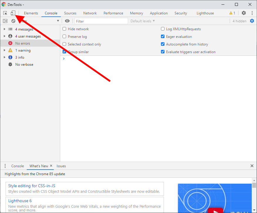
Click that icon and the corresponding Chrome window will show a narrow browser window. The downside is that it’s not dynamically resizable like the first solution is.
To enable DevTools in Chrome, click the 3-dot menu in the upper right corner of your Chrome window, then select More Tools -> Developer Tools or press the F12 key.
Solution #3 Chrome Developer Tools in Sidebar
Yet another solution using Chrome DevTools window is to bring up the DevTools window in the sidebar of your browser. When you do this, it squishes the website part of the browser and you can make it as thin as you want. Here’s what that looks like:
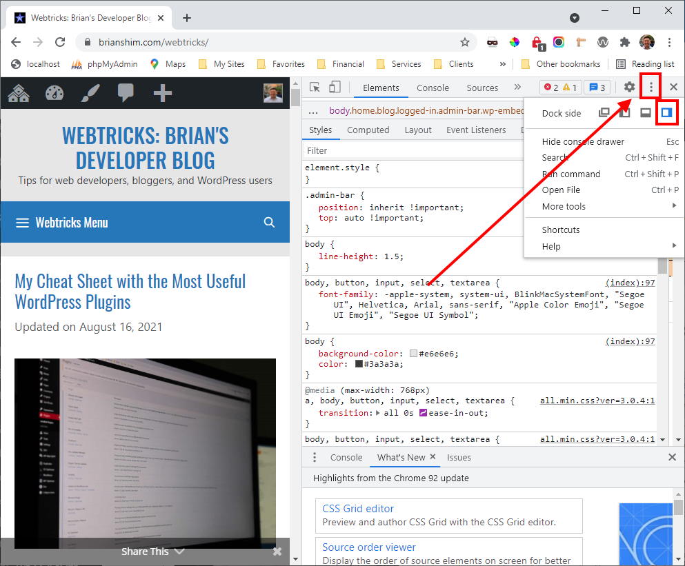
To move the DevTools window to the sidebar, click the 3-dot menu in the DevTools window, then select the “Dock to Right” icon as shown above.
Conclusion
Was this useful to you? If so, please let me know in the comments below! – Brian
Featured Image Photo by Goran Ivos on Unsplash.

I am a freelance web developer and consultant based in Santa Monica, CA. I’ve been designing websites using WordPress and from scratch using HTML, CSS, PHP, and JavaScript since 2010. I create websites and web applications for businesses, nonprofits, and other organizations. I have a degree in Electrical Engineering (BSEE) from California Institute of Technology and a degree in Engineering Management (MSEM) from Stanford University.
Please Leave a Question or Comment
Mr. Shim, thank you very much for this. This really help me since my favorite browser, Opera can no longer resize below 500px in its newest update
Thanks for sharing! I didn’t know about that change to Opera! Glad you found this useful. – Brian
Thank you very much! Very efficient and useful!
Thanks, glad you found this useful! – Brian
Ref the problem I mentioned earlier, I was using Chrome on my iPhone and even after deleting cache the .css file isn’t refreshing. But my website and my coding look perfect in Safari, so 4 hours of wasted time later, LOL, it’s not my coding!
Thanks again for your tips!
Hi Peter,
Ah, yeah, mobile browser caches can be a pain to clear. I’ve been there. Sorry about the wasted time, but glad you solved it!
Best,
Brian
I was all ready to download Firefox when I read Solution #3. Works great! Thanks.
I still have my problem though.
I use a media query for max-width 320 to reduce my font size, and it works great in every responsive web design screen tester I’ve found on the web… but not on my iPhone itself.
And I know my screen size is 320 as I see the number on my screen from this bit of code I use:
<script type=”text/javascript”>test=”<p class=’Text’ style=’text-align:center;font-size:25px’>Screen width: “+window.innerWidth;document.write(test);</script>
Thank you,
Peter
Thanks for this. Solution 1 looks useful but I need a link / bookmark that I can just click on to open a skinny window when I need one. I was not able to right-click copy from your ‘open thin browser window now’ button. Any chance you could make it work like that, please?
Hi Orcadian,
The problem with that is that the JS-launched thin browser doesn’t let you enter a URL; it has to be pre-defined at launch time. So even if you could have that thin browser button, it would be a blank page with no way to go to your page.
Instead, you could use this link which jumps you right to the URL field:
https://brianshim.com/webtricks/chrome-browser-window-that-you-can-make-narrow/#solution-1-launch-a-resizable-chrome-window
Best,
Brian
wow! am so grateful to you for this generous help… You are a star!
#1 is really helpful — thank you for this
option 3 is good for me, thanks.
I hope you keep this around for the long term, please don’t shut it down! I’ve been using this tool for years and it is one of a kind. Bless you sir!
Dear Thankful User,
Thank you for your note! I will indeed keep this article around! I’m glad it is helpful to you!
Best,
Brian
Hello! I wanna open webpages, use chrome, by shortcut, open as ‘narrow’ window.
Until a few days ago, the width of the chrome window running with the shortcut was under 500px. But now it doesn’t decrease below 500px. Can’t we modify the shortcut to lift the width reduction limit of the chrome window?
I’m so happy to find your JavaScript. However, I want to make the Location Bar disappear, and it would be great if I could modify the Chrome shortcut and open a specific page in a narrow width. If you know how to solve it, can you help me?
Hi JJ,
I don’t know if there’s a way to make the location bar disappear; Here’s the code though:
Best,
Brian
Sorry, here is the code:
https://brianshim.com/demos/thin_chrome_window_test.html
Best,
Brian
I used this trick to watch youtube in a miniwindow.
Thank you so much for making this. I use this almost every day when doing mobile css. It is very very useful. Please never ever take this down. Thank you so much once again!!
Hi Jacob,
So glad this is useful to you! Thanks for sharing.
Best,
Brian
am 16 and i have been struggling alot with this thanks alot men
YOU ARE AWESOME!
Great post. Surely this post going to help mobile app developers.
In the developer window, top left, there’s a mobile icon next to the “search” icon. Use it to toggle in and out of “Device Mode”. There you can shrink the screen as much as you want, while keeping the Developer window as large as you need.
I just found it, and it’s really neat :)
https://developer.chrome.com/devtools/docs/device-mode
HI Wagedu,
Ah, yes, thanks for pointing that out!
Brian
The ‘mobile icon’ works a treat. I love toggling through the various models.
It seems iPhones up to 5S, and Galaxy phones up to S4, seem to have 320px as their narrowest width.
I feel that most of the custom @media divs I make in CSS are attributed to these ‘320’ screens.
Fortunately the later models aren’t as narrow.
Great thread and post, thanks :)