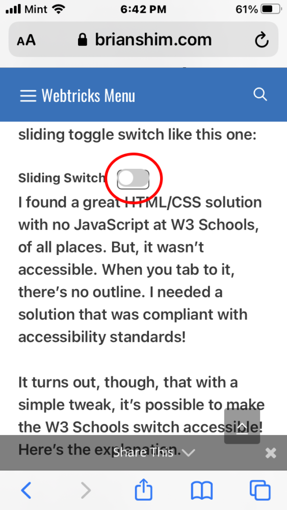
I was working on a web application that required a sliding toggle switch like this one, but was also compliant with accessibility standards:
I had known of this HTML/CSS solution with no JavaScript at W3 Schools. But, it’s not accessible. When you tab to it using the keyboard, you can turn it on or off using the spacebar, but there’s no outline to tell you that you’re on it. I needed that outline so it would be compliant with accessibility standards.
It turns out, though, that with a simple tweak, it’s possible to make the W3 Schools switch accessible! Here’s the explanation.
How It Works
The W3 Schools solution and many others out there use a checkbox as the basic HTML element, but it’s hidden in some way (in this case, with opacity:0). The toggle switch that you actually see is a fancy version of the checkbox’s <label> tag!
With the checkbox hidden with opacity:0, the outline that usually shows up when you tab to it using the keyboard is also hidden. At first, I thought there was no solution to this.
But, if you unhide the checkbox, you’ll see that the slide switch sits on top of it and covers most of it, and with some resizing, the outline can be made visible!
At first, I played with precisely sizing and positioning the checkbox so that it was hidden by the slide switch, but its outline showed up around it. I ended up playing “whack-a-mole” because the positions were different on Safari and Chrome, and I couldn’t come up with positions that hid it for all browsers.
Then I tried using “-webkit-appearance: none”, and that effectively hid the checkbox on Safari but did NOT hide the outline when focused! Perfect!
The iOS Problem
There was one problem though: On iOS, the checkbox outline was visible when the switch was in the “off” position. This was the case on mobile Safari and Chrome. Android was fine.
For this solution, I use a CSS media query to detect iOS, and make the checkbox input have opacity: 0. I lose the accessibility outline, but I figure that on iOS, most people will be using a touchscreen and not the tab key to navigate, so it’s not a big deal.
The Finished Code
Here’s the final code. Note that you might have to tweak the sizes and positions to get things to center properly in your CSS environment. As I mentioned, much of this code is from the W3 Schools post.
HTML
<div class="slide-switch">
  <label class="switch-label" for="sliding-switch2">Sliding Switch</label>
    <label class="switch">
      <input id="sliding-switch2" type="checkbox">
      <span class="slider round"></span>
  </label>
</div>
CSS
/* ===================================================
  HTML TOGGLE SWITCHES MODIFIED TO BE SMALLER AND ACCESSIBLE
  https://www.w3schools.com/howto/howto_css_switch.asp
  =================================================== */
/* The switch - the box around the slider */
.switch {
  position: relative;
  display: inline-block;
  width: 36px;
  height: 20px;
}

/* Hide default HTML checkbox BUT KEEP OUTLINE WHEN SELECTED WITH TAB KEY! */
.switch input {
  width: 36px;
  height: 22px;
  appearance: none;
  -moz-appearance: none;
  -webkit-appearance: none;
  vertical-align: text-bottom;
}

/* HIDE THE CHECKBOX COMPLETELY ON IOS */
@supports (-webkit-touch-callout: none) {
  .switch input {
    opacity: 0;
  }
}

/* The slider */
.slider {
  position: absolute;
  cursor: pointer;
  top: 0;
  left: 0;
  right: 0;
  bottom: 0;
  width: 36px;
  background-color: #ccc;
  -webkit-transition: .4s;
  transition: .4s;
}

.slider:before {
  position: absolute;
  content: "";
  height: 16px;
  width: 16px;
  left: 2px;
  bottom: 2px;
  background-color: white;
  -webkit-transition: .4s;
  transition: .4s;
}

input:checked + .slider {
  background-color: #2196F3;
}

input:focus + .slider {
  box-shadow: 0 0 1px #2196F3;
}

input:checked + .slider:before {
  -webkit-transform: translateX(16px);
  -ms-transform: translateX(16px);
  transform: translateX(16px);
}

/* Rounded sliders */
.slider.round {
  border-radius: 16px;
}

.slider.round:before {
  border-radius: 50%;
}

/* LABEL ADDED BY BRIAN */
.switch-label {
  display: inline;
  font-size: 14px;
  font-weight: 500;
  padding-right: 8px;
  vertical-align: top;
}
.slide-switch {
  display:inline-block;
  white-space:nowrap;
  margin-right: 40px;
}
The switch at the top of this article uses this code. As I mentioned, you may need to tweak some of the sizes and spacing for your application.
So far I’ve tested this on Windows Chrome, Windows Firefox, Edge, Safari, MacOS Chrome, Mobile Safari, iOS Chrome and Android Chrome. Let me know if it works for you! – Brian

I am a freelance web developer and consultant based in Santa Monica, CA. I’ve been designing websites using WordPress and from scratch using HTML, CSS, PHP, and JavaScript since 2010. I create websites and web applications for businesses, nonprofits, and other organizations. I have a degree in Electrical Engineering (BSEE) from California Institute of Technology and a degree in Engineering Management (MSEM) from Stanford University.
Please Leave a Question or Comment